Wednesday, November 6, 2013

Element Texture by Texas Artist Laurie Pace

Line Shape Form Space Value Color Texture

"Texture adds quality to a painting and makes it appear more realistic. Texture draws the eye of a viewer – dry brushing, sponging-on, spattering with paint-loaded brush... Spattered dots become the 'diamonds' that add sparkle even in the darkest shadows. " George Politis


Texture is the quality of a surface, often corresponding to its tactile character, or what may be sensed by touch. Texture may be used, for example, in portraying fabrics. It can be explicitly rendered, or implied with other artistic elements such as lines, shading, and variation of color. 


Tonight the pineapples will be started by my students. Last week we finished up color and did not even make it to the pineapples... but I have painted mine ahead to share in the lesson. I chose the pineapple because of the layering of so many textures and the diversity of their differences.   The pre painting I did for an example is what you are seeing here.   I will be going to it from a different approach when we paint tonight.   There is NO right or wrong way as long as you are creating texture in your own style.  I worked from the back forward and have tried to post images of the progress.  I worked quickly, so this was a fast study more than a full painting.


So you have my pineapple sample and time to try your own.  A wonderful challenge for texture and discovery while you paint.


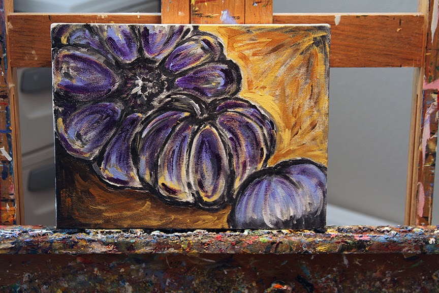
Here is one of the last pictures of our pumpkins. I love the excitement when students are taking shots... and smiling.

Matthew 6:21 - Where your treasure is, there will your heart be also. 


Read more: http://lauriepace.blogspot.com/#ixzz2jsXL68Ik

Monday, October 28, 2013

Line Shape Form Space Value COLOR... Color is our next element of Art by Texas Artist Laurie Pace

Line Shape Form Space Value Color 


"Colouring does not depend on where the colours are put, but on where the lights and darks are put, and all depends on form and outline, 
on where that is put. " (William Blake)


ThPumpkins began to bloom in the studio and it is now time for color.  Working in Acrylic, which is not the medium of choice for me for still life painting, I plunged ahead with student Lisa eagerly jumping into the challenge.


Both of the above are my pieces.

Remember last week, we began with just values using black and white. Now it is time to begin applying color.  I found it easier with the acrylics to do it layers letting some bleed through from below and you can watch as some change through the process.

This is Lisa at work and her progress with her pumpkins. She will be back tonight for more and we will be gearing up for TEXTURE! ( I really see a lot of texture in her current work.)


Here are my pumpkins as they are sitting right now. Some are finished, some are not. Some I am tempted to jump in with oils!


Hummm... what to do tonight with texture. Lisa and Sheryl are you ready?


Thank you again Rebecca Zook for your inspiration with values into paintings. 
Click here to see Rebecca's incredible work using this process in her paintings.


As surely as I valued your life today, so may the Lord value my life and deliver me from all trouble.”  1 Samuel 26:24  

Monday, October 21, 2013

Value... Elements of Art by Texas Art Teacher Laurie Pace

Line Shape Form Space Value


"Color is an inborn gift, but appreciation of value is merely training of the eye, which everyone ought to be able to acquire. " John Singer Sargent


Value, or tone, refers to the use of light and dark, shade and highlight, in an artwork.  One of my favorite painters current day that uses this in many of her pieces as an underpainting before she paints her colors in, is Texas Artist Rebecca Zook. Her work is incredible.  Working in acrylic, she lays in her values before layering the colors on top.  Texas Artist Nancy Medina, sort of does this but with transparent colors creating the forms and backgrounds of what she is painting.  When I took one of her floral workshops we worked with browns and moved forward.  

With this lesson being on values... I want to take Rebecca's challenge of the black and white acrylic painted first and then layering of color...so this week I have examples of two pumpkin paintings because I loved her pumpkin painting and Terry specifically brought me home pumpkins to work from.  Value paintings can indeed be done with any ONE COLOR (blue, green, red, etc) and adding just white or black to make dark values and intermediate values and light values. Following the thought behind Rebecca's work is to stay true to the values using black and white and all in between.  If you can access this link, you can see quite a few of her pieces she just completed using this technique by clicking here.

Okay, so I took off into the studio with two student grade canvas panels, my pumpkins and charcoal.

I find sketching in charcoal allows me freedom to easy change my areas as I sketch them in.

This is the first one with two neighboring pumpkins.


First I painted in the darkest area and the 'atmosphere' around it. I have never tried this, so we are doing it together as a first.   I normally use acrylics to form up backgrounds for my oils.. but I use one color, so painting with a brush feels strange too.


I am wondering if my values are too dark, but I am assuming until I try it I will not know.


This is actually the pumpkin we will carve. It is the tallest of the group we brought home from Whole Foods.  Terry has plans for roasted pumpkin seeds and a fresh pumpkin pie.


I snapped one a bit closer up so you could see some of the light I was trying to capture off the top of the pumpkin.  Rebecca must have so much patience to paint like this!

This is the final on this one but I forgot to finish the leaves I was going to place in the background... using imagination of the pumpkin patch itself.   

Next week I will have color added to this. Perhaps not as beautifully as Rebecca does because I am not an acrylic painter and it definitely is much harder than oils!

So get your brushes out and buy some of those little pumpkins and gourds in different colors. There are some really cool choices out there. Call it painting the gourds and get painting!

"When beginning artists understand and use values for the first time, there is usually a quantum leap in the quality of their painting." Paul deMarrais

Wednesday, October 16, 2013

Fourth Element of Art by Texas Artist Laurie Pace

Line Shape Form Space


Frank Lloyd Wright said:     "Space is the Breath of Art."


By definition:  Space is an element of art; space refers to distances or areas around, between or within components of a piece. Space can be positive (white or light) or negative (black or dark), open or closed, shallow or deep and two-dimensional or three-dimensional. Sometimes space isn't actually within a piece, but the illusion of it is.

With little ones we always have donut day when I teach space...but we cannot do that over the internet.  So I took up my pencil and looked around the studio. I spotted first one of my stools in the studio... so I quickly shaded in the space around it.  Then the coffee cup holding my hot tea.... and then just a jack that was sitting on the table. (More of my work further down in the blog.)


So how can you turn this into art that it works in a composition?
Here is an example by M C Esher. 


"Sky and Water I"  is a woodcut print by the Dutch artist M. C. Escher first printed in June 1938. The basis of this print is a regular division of the plane consisting of birds and fish.  Can you see how he took the top duck and then began developing the space around it to turn it into fish?    You can click the drawing to read more in Wikipedia.

Here is one more:


Regular Division of the Plane is a series of drawings by the Dutch artist M. C. Escher which began in 1936.  This was from Wikipedia.  
Click the drawing to connect.


When I taught seventh grade art, we studied Escher and the students had to design something similar using outside space from one object evolving into another one.

Here is the one I did for the sample lesson. I took caterpillars and made them into butterflies.


Close up of the work. It was not completed as I wanted them to design and use their space in their own way. I rarely finished a project as I wanted them to see in in progress so they knew where it was and how it came to be, yet far enough along to see where it was going.


What can you do this week to work on 'space'? If you want to use paint,  I discovered this blog with a wonderful lesson on negative space for those of you with watercolors.  Click here.  Pat Howard is the teacher in this blog and she has some wonderful ideas and lessons... this would be one I would recommend to follow as I plod forward!


Monday, October 7, 2013

Third Element of Art FORM by Texas Art Teacher Laurie Pace

Third Art Lesson
The Seven Elements of ART

Line, Shape, FORM


Form is usually the element my younger students love. Basically form is dimensional.  Form is a three-dimensional geometrical figure.  Where you normally have a circle, in form it is a sphere.  Where you have a square, in form you have a cube.  


My images shared will be from a simple project.  If you want to get fancy, do some carving, paper mache or anything that dimensionally builds shape. You can actually still do a two dimensional painting and use a palette knife and build up layers, and presto... you have form.  You can also do mixed media and have things pasted and gessoed onto the surface and that counts as form as well. 

Working with mixed media is always fun. Collaging and using different papers and objects to create art is very exciting.  Try and do some different types of art that allow you to use FORM.

I went into the studio to figure out something to share for an exercise besides carving a pumpkin or working with clay. Those are obvious Three Dimensional objects.  So how about mixing two D and three D?


First I chose colors...and decided to work with three together on the color wheel: Red, Yellow and Orange
Then I chose one opposite the Orange... which was a blue and I went with a teal type blue that had some green in it to balance the red.  Split Analogous Colors.

I rummaged around in my papers... and found these precut small watercolor papers.  I pulled out a bunch but after I grabbed a square canvas panel, I realized I only needed four. I still had no concept yet what I was going to do.

As I begin to paint the small pieces colors...like red on one side, orange on the other... I thought cool, I can paint the surface in squares. Originally my brain thought flat black, but I wanted this to build dimensionally with form, shape, line and this would do it.


See the black lines separating the shapes (Squares)?


Then I glued the square forms painting on two sides onto the surface two dimensional square.  Note that I matched up the fold to the color on the flat square. Another decision NOT pre-made but discovered as I worked.


 So simply put and made...  FORM....


This was only a small project... can you experiment this week with form? If nothing else, CARVE A PUMPKIN!

Monday, September 30, 2013

Second Element of ART... SHAPE, Lessons in Art by Texas Artist Laurie Pace

Lesson Two
Seven Elements of ART

SHAPE
( We have done Line and this week we are doing Shape.)


When contemplating shapes and all the many times I have taught shape to younger students, it consisted of drawings of three shapes and creating a composition with it.  

For the example I chose a rectangle, a circle and a triangle.  You can see there are endless combinations for those three objects, but the key is training your eye for composition and what really works with balance to the eye.  There are also other factors, is the surface a square, a rectangle horizontal or vertical?

Going a little bit further sharing some ideas that are more fun, and maybe this week I would have time to explore it too... is the idea of creating a mandala.  Originally Hinduism/Buddism, Mandalas have come down through the centuries as part of our art, with many parts filtering into all faiths.   

Painted 17th Century Tibetan "Five Deity Mandala


Wikipedia  http://en.wikipedia.org/wiki/Mandala

Mandala (Sanskrit: मण्डल Maṇḍala, 'circle') is a spiritual and ritual symbol in Hinduism and Buddhism, representing the Universe. The basic form of most mandalas is a square with four gates containing a circle with a center point. Each gate is in the general shape of a T.  Mandalas often exhibit radial balance.  The term is of Hindu origin. It appears in the Rig Veda as the name of the sections of the work, but is also used in other Indian religions, particularly Buddhism.   In various spiritual traditions, mandalas may be employed for focusing attention of aspirants and adepts, as a spiritual teaching tool, for establishing a sacred space, and as an aid to meditation and trance induction.  In common use, mandala has become a generic term for any plan, chart or geometric pattern that represents the cosmos metaphysically or symbolically; a microcosm of the universe.

Why Mandalas?  They use shape to create the art... reflecting shapes that leave balance to the soul and the eye.  

When I look at the Book of Hours, the Celtic cross (one is around my neck), the rosary, the halo, the crown of thorns, and rose windows.... you can find it crossing into the Christian faith by design.  See below....

In my art classes we study the Book of Hours for a six week period, delving into the history and the creation of our individual pages for our own Book of Hours, a prayer book.


You can see in the repeating shapes and design the similarities to the Mandalas using repeating shapes and patterns. 

As I mentioned, the Celtic Cross is another example of the designs used from the Mandalas, as well as the Rose Windows found in many Christian churches.


Why Mandalas?  They use shape to create the art... reflecting shapes that leave balance to the soul and the eye.  

So as you do your shape studies this week, you might want to try a Mandala.
I found this wonderful blog of Mandalas to color.  

http://coloringmandalas.blogspot.com/


I also found many samples on YouTube but my favorite was this one. Enjoy your week and think of all the different things to do with shape this week. Keep it simple and have fun.  


Monday, September 23, 2013

Contour Drawings, Element Line with Texas Artists Laurie Pace

CONTOUR DRAWING   Element of Art: Line
  © G.O.D. Laurie Justus Pace      Graphics One Design 2013

Thursday... it is Thursday right?

I decided today to try something different. I have zero idea if I can keep up with it or keep up with you, so let's give it a try.   I have taught workshops for a few years now, but my strength is teaching art.  Not just painting, but teaching art. I have taught art for over 35 years. Just typing this makes me feel old, but I truly have. I have taught in my studio all this time, did about 5 years in private school and probably 6 years in public school in Art.  Having you paint with me daily like other artists do is good, but strengthening your composition skills and sharpening your knowledge in art really gives you a stronger foundation as an artist with your paintings, drawings, sculpting etc.

When I teach a workshop much goes into prep for the class and I stress how important it is to set up an area and be ready to make art. I hope you will go ahead and do that if you do not have an area.  This first lesson is using only two things.. a pencil and a sketch pad. Nothing more or less tool wise, but add to it your eye and learning composition and line and we will jump right in.

There are seven elements in art. Every time I teach a lesson, you need to figure out what elements we are using in that lesson. This first lesson is on something simple, "line".  We are going to do a contour drawing...actually I hope you will do them for a few days.  Find something in the room to draw and pick up your pencil and begin.
  

BUT... you cannot look at your sketch pad and you cannot lift your pencil. The line is ONE CONTINUOUS LINE.  You start and when you stop or lift your pencil you are done.  No cheating and no looking at your sketch pad or you defeat the purpose of strengthening your eye and 'feeling' your way through a drawing. No erasing, no looking...only one continuous line. Start to stop. You can go soft, hard, or in between but you cannot look or lift your pencil.


This first one was drawing my mug of paint brushes in my studio. I knew it would be both fast and fun.  This is suppose to be fun. 


This was of my easel and quite a bit harder.  Then I spotted those paints and my paper palette. I pulled my chair close and put the pencil to the sketch pad.


This should be quite freeing to you. Sketching fast is totally different than one continuous line.  You hand is moving and NOT looking at anything but the object you are drawing. You are after the CONTOUR of what is there. You are studying LINE.  Good luck with yours and let me know how you are doing. This will be the first time I use the InLinkz Link up.  

So please join me by sharing yours. 


An InLinkz Link-up


 A Texas Artist
 Laurie Pace

http://ellepace.com

Share Art Lessons by Texas Art Teacher Laurie Pace